We’re changing the look of microCloud and this is why that’s awesome!
A brief microCloud history lesson…
microCloud was formed back in 2004 with the purpose of designing and manufacturing elite bedding for the luxury accommodation market.
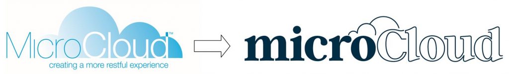
Since the introduction of microCloud, 15 years ago, we have been using the same logo and not much has changed in terms of the look.
But a lot else has changed over the years.
Our luxury bedding range has grown from 1 pillow to now consisting of 13 different product lines.
Our customer groups have also evolved dramatically. From initially selling only to luxury hotels, we now supply a large portion of the Australian accommodation market (hotels, motels, apartments, interior designers and the Air BnB & short-stay sector).
And due to popular demand over the years, microCloud products were made available to the retail public for you to purchase for your home.
Why is microCloud changing the look and feel?
So here we are in 2019 reflecting on where we have come from and where we are at now, and who our customers are.
We felt (and our customers too) that the aesthetic of microCloud needed somewhat of a polish, a bit of love, a ‘lick of paint’ — to better represent what we are about and to allow the microCloud brand to better resonate with all our customer groups in terms of the look & feel.
We wanted to bring consistency and unison across the board.
From our research, words such as light, fresh, luxury and dreamy kept appearing as underpinning the microCloud brand. This formed the basis of the brand refresh in terms of colour, design and imagery selection.
Also, since 2004, the internet and online world has evolved. The tech industry often featured light blue as the go-to colour. As a result, we were often mistaken as a tech company.
Our products are loved. But we need to be a more engaging brand aesthetically.
Now became the ideal opportunity to give microCloud a creative polish to present a fresh, current look. To take microCloud into the future and align with how you, our customers, perceive us.
So… what is actually changing?
You’ll immediately notice that our logo has taken on a new look. To complement this, the general aesthetic including colour schemes, font & imagery will present a fresher feel.
We’ve still got the same name, same team and same amazing products that you all love and that keep you in bed longer than you should.
You may notice during this transition period, that some products will have the old branding, and some products the new branding. Rest assured the products are exactly the same, just the logos, and packaging may be different.
In saying that, we do have a few exciting changes around the corner. We are working on a new website design. PLUS some amazing new products that you have asked for. All of which we’ll let you know more about in due course.
So stay tuned and we’ll keep you updated along the way. Be the first to know by signing up to our newsletter here or by following us on Facebook and Instagram.
Tony Blanch
Co-Founder at MicroCloud microCloud